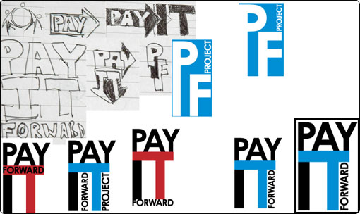
I found the Pay It Forward Project group on the web, and offer my services to re-brand and re-design their website.
During this process, I began sketching out ideas on paper for PIFP, always keeping in mind to keep it clean, modern and simple. I also tried using negative spaces a lot, shapes, and typography. After a few sketches had been done, I did some digital renders, and came up that really worked as a logo, as a brand. Colors were vibrant, which called a lot of attention, and the typography flowed nicely.