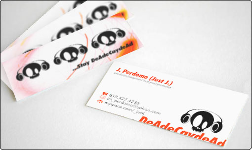
J. Perdomo wanted a fresh and hip looking business card for his brand. The logo was provided to implement in it, and the project began.
Experiments with colors led me to choose a vibrant shade of orange to make everything stand out, from the back of the card, to the name of the client and icons on it. However, the design didn’t feel complete, until typographic cropped elements were implemented on the lower corner of it.